I found this post, barely started, in the drafts and decided to open it up to finish and post it. What made me laugh out loud is that the following text is what I had written in 2019:
Alrighty, folks, I'm dedicating an entire page of my blog thing to the great J. Scott Campbell! Recently, he has come under fire by the idiot brigades of Twitter for his stylized way of drawing women. Rather than realizing that the art doesn't speak to them, and therefore isn't likely intended for them, they choose to screech and bawk about how it needs to change and he should lose work. Going so far as to imply that he, a man who is happily married to a woman who is also an artist, has never actually seen a woman in person.
I read that and lost it. Why? Because this exact same discourse popped up online once again in 2021. This time, however, Mr. Campbell clapped back!
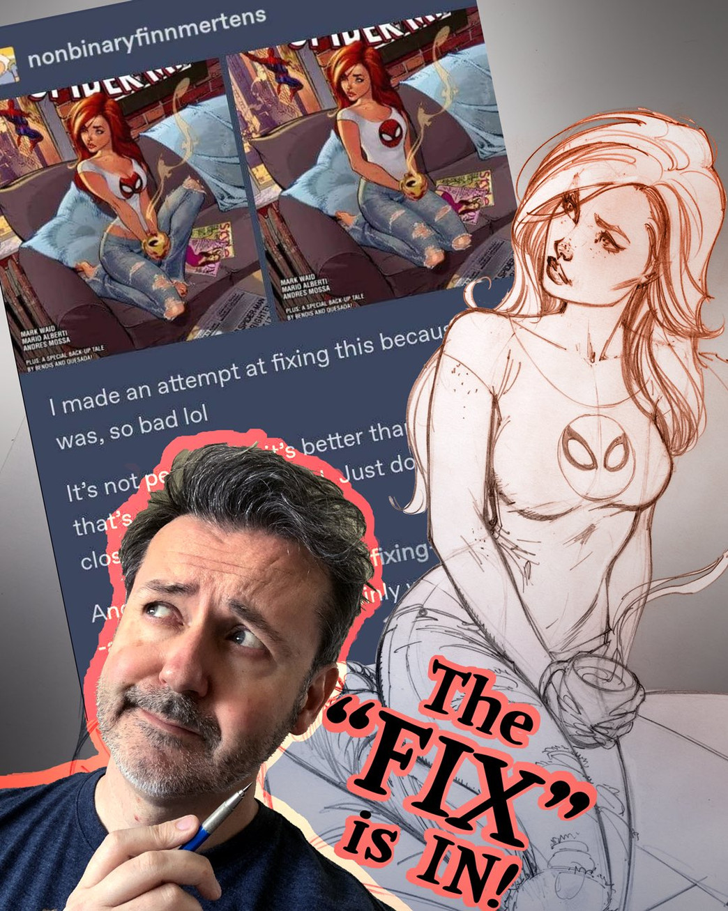
The "offending" art piece

The piece of artwork that had weirdos screeching online this time was the artwork for the cover of Amazing Spider-Man #601.
The cover features Mary Jane Watson looking over her shoulder longingly out a window while holding a hot beverage of some kind. You can see Spider-Man webbing off into the distance and she is tucked up and a cosy position sitting upright on a sofa.
Personally, I think this cover is gorgeous. Everything from the detailed background, to the way the steam is rising off of the cup adds to the overall vibe of the image in a very tactful way.
Apparently, a lot of other people saw this cover and became fixated on the idea that Mary Jane is somehow being overly sexualized in a way that demands offense and outrage. Resulting in people online insisting that her body's anatomy is beyond acceptable levels and falling back on the old "Where are her Organs?" meme without any sense of irony.
The Final Catalyst
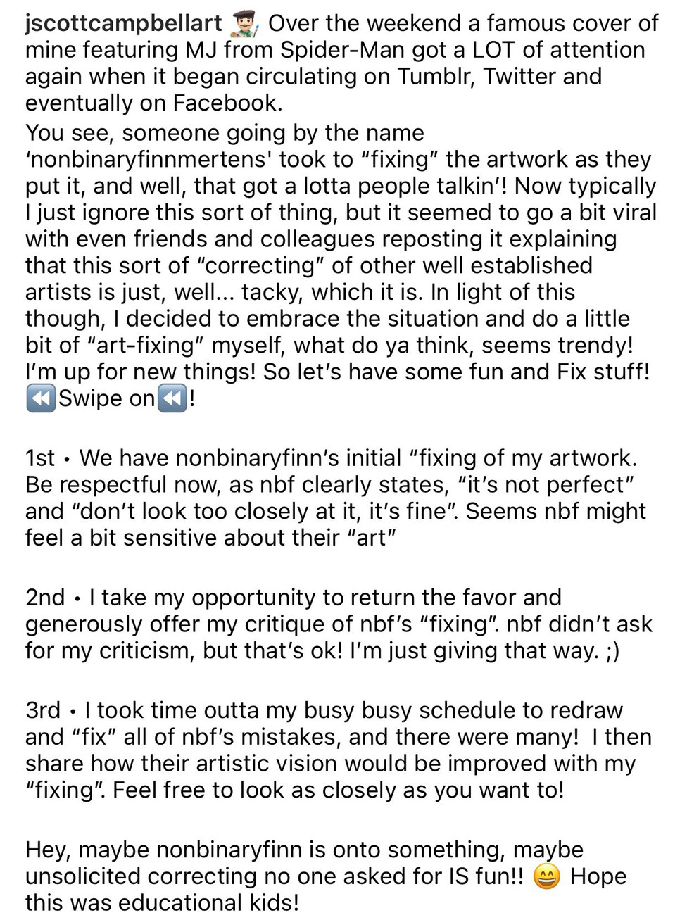
It seems like the thing that finally got J. Scott Campbell to respond to the internet weirdos (with more than a playfully snarky comment) was a young, overzealous, artist who thought they might take a crack at "fixing" the artwork going viral.


The biggest issue I have with this Tumblr post is the "it was, so bad lol" statement. I'm not sure what world they live in but there's nothing objectively "bad" about the original artwork. In fact, they "fix" that went viral seems to put her in an even MORE unnatural looking sitting pose, in my opinion.
The Professional Responds
After the "fix" continued to go viral, J. Scott Campbell did something that hadn't really been done before. Certainly not by a long-standing industry professional. He responded with what I'd consider a free master class on art, posing, and anatomy.
To be completely honest, the way he responded wasn't even rude. I'd argue that it was far more polite than the initial "fix" that went viral to begin with. He doesn't make any personal attacks and genuinely adds context to the choices he made in the original artwork. In the end, he even presents how he thinks the "fix" should have looked by pointing out the things that seem to have gone wrong in the tumbler user's "fixed" version.
The Response to the Clap-Back
A lot of folks found his response to be a refreshing change to the usual trend of hollow apologies. The fact that he showed no remorse for his art style, and defended it in a way that was creative and fun, meant a lot to other artists who don't have the platform he does to defend themselves when attacked.
Of course, there were also folks who insisted that it was just an example of an adult man attacking a "child" online. I'm a firm believer in that if someone is willing to dish out critique, they should be fully prepared to receive it in return. Especially when the response that J. Scott Campbell released was informative and playful when the initial post's sentiment was obviously negative and hateful.
He used it to start healthy conversations about art
If you take a peek at J. Scott Campbell's Twitter account right now, you'll see it flooded with "Draw this in your Style" retweets. This is because, in addition to auctioning off the artwork he drew for his "fix", Mr. Campbell has begun breaking down the difference between drawing an "homage" and claiming to "fix"existing artwork.
He started by posting examples of times that his artwork has been redrawn in homage and times he's redrawn other artwork (even his own) in homage. Pointing out the differences between the respectful nature of a "redraw" or "homage" in comparison to the "I fixed it" mentality.
This helps highlight something that I try to talk about as often as possible. Art is largely Subjective. What is appealing to you may not be appealing to someone else. Very few people are actually qualified to give detailed critique regarding artistic skill. Regardless of what Twitter would have you believe, those people are rarely trolling through tumblr crying about sexualized women.
Cosplayers United in solidarity!
Another result of this viral phenomenon is the large influx of female cosplayers taking it upon themselves to prove that the positioning and anatomy of Mr. Campbell's Spider-Man #601 isn't actually very far-fetched at all.
The example above is just one, of many, and I encourage you to check out the relevant hashtags to see more!
In conclusion
Some of you may note that there are parts of the discourse that arose from this kerfuffle that I've left out of this post. That's because I'm trying to focus on the art side of things. Especially when, at the end of the day, J. Scott Campbell is an individual who promotes and supports individuals. I respect him staying true to himself, regardless of what anyone throws at him from any direction. I'm a firm believer that artists shouldn't ever feel as though they are in competition with each other. No two artists should be creating identical artwork anyway. Let's focus on lifting each other up! Or, at the very least, not tearing each other down. Eh?
.png)


Comments